THE TIME GOES PAST
[this post is contributed by Phish.net user Paul Jakus, @paulj, who continues to contribute to the site in different ways. Thank you Paul! – ed.]
It seems unbelievable, but in 2018 Phish will embark on their tenth year of touring since returning from their breakup. Following last year’s Baker’s Dozen run, many speculated that we may have reached the peak of Phish “3.0.”
Setting aside one rain-shortened concert (7/19/2013), there have been 358 shows since March 6, 2009. The average show rating on Phish.net was 3.944 (out of 5), but the lowest-rated event was Grand Prairie’s 2.377 (10/25/16). If Phish reached “bottom” as recently as 2016, have they really been getting better since their return? We can use show ratings on Phish.net to test this hypothesis, but let’s start by getting a few caveats out of the way.
Ratings on Phish .net are unlikely to be representative of the population of Phish fans as a whole. First, I suspect that .netters are among the most enthusiastic members of an already rabid fanbase. This may bias show ratings up or down--frankly, the hyper-critical nature of .netters means the direction of bias is not clear, but some sort of bias could be present. Second, not every .netter rates every show and I’m guessing that most of us are more likely to rate shows we’ve attended or watched on live video. This is, of course, the attendance bias effect discussed so often on .net. If attendance motivates a person to rate a show, then ratings on Phish.net will be biased upward. Third, a hot show on a current tour will sometimes zoom to the top of the all-time list, only to drop lower as more people provide a ratings weeks, months, or even years later. This “recency bias” results in higher ratings for recent shows relative to those from long ago. Fourth, the number of users on .net has been growing in recent years; if new .netters differ from long-time .netters (having, say, less familiarity with Phish performances from years past), then ratings from 2017 may not be comparable to those of 2009. Finally, the data reveal a “herd effect” for outstanding shows: more people will rate a great show than will rate poorly received show. We’ll be using the average rating for shows, though, so it’s not clear that the herd effect will bias a show rating. These caveats mean that our statistical analysis applies only to those of us on .net, and does not necessarily represent the broader population of Phish fans. That said, let’s take a look at the data.
The scatter plot below depicts the show rating on the vertical axis and the show number on the horizontal axis, where March 6, 2009 is show number 1 and performances are numbered consecutively thereafter. A slight upward trend is evident, and a regression line of “best fit” confirms a statistically significant time trend (P<0.001). The red line has a constant slope equal to 0.0017, implying that every new show adds 0.0017 to a show’s rating.
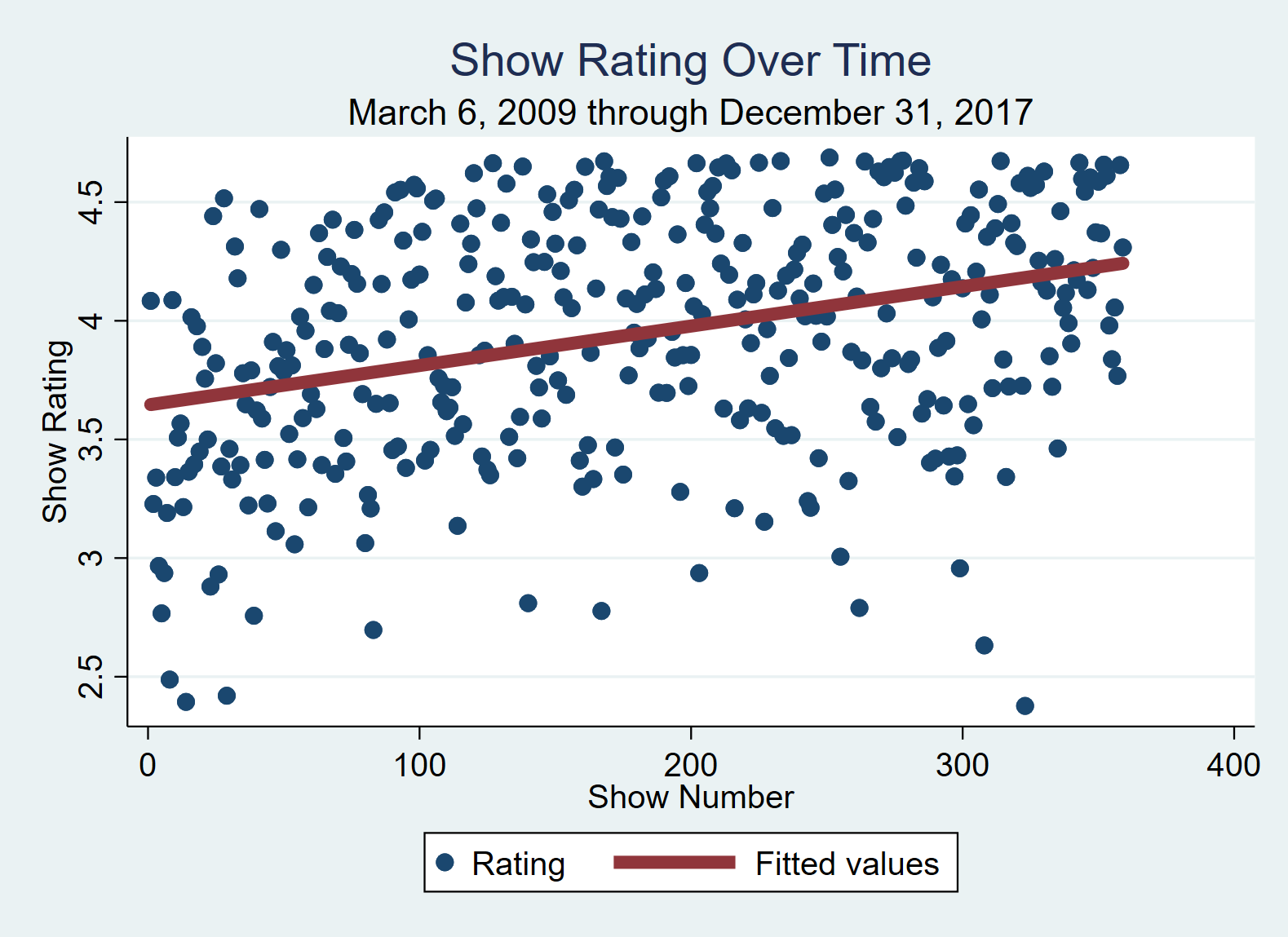
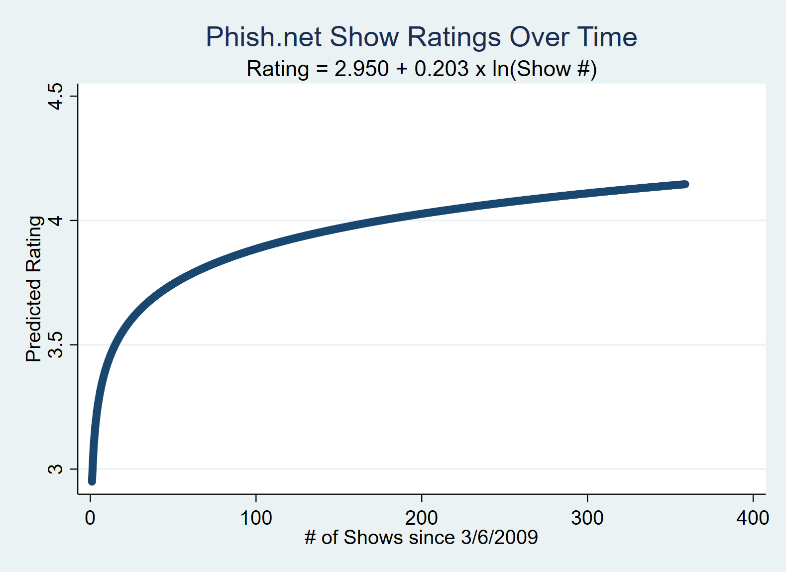
Can we really expect the show rating to increase by +0.0017 for each show played? No. A more reasonable hypothesis is that the first two or three years of Phish 3.0 were spent rapidly improving performance quality, after which their ability to improve from show-to-show slowed down. We can account for this non-linear effect by converting the show number to its natural logarithm and then re-estimating the time trend, as shown below. Again, the slope is highly significant (P<0.001); goodness of fit measures (R-square and F-test) indicate that the nonlinear model is superior to the linear model. The nonlinear approach implies that Phish’s 50th show after returning to the stage in 2009 added +0.004 to the show rating, the 100th show added +0.002, and the 300th show added only +0.0007—about 2.5 times smaller than the estimate from the linear model.
The two regression analyses verify a positive time trend, but tell us nothing about variation from performance to performance. An improving average is nice for fans, but if a great show is nearly always balanced out by a stinker, well, that’s not so nice. If Phish truly are improving (and the eyes and ears of those fans rating shows on Phish.net are to be believed), we should see an increase in the average show rating AND a decrease in show-to-show variation.
A “box and whiskers” plot, by year, is shown below, where show rating is on the vertical axis. Look first at the plot for 2009. The horizontal line within the shaded box is the median show rating (3.48); the median show ratings for other years are depicted in their respective boxes, with the highest occurring in 2015 (4.266). (In 2009, the median means that 50% of the shows were rated higher than 3.48 and 50% were rated lower). The shaded, rectangular box depicts the interquartile range (IQR), or the 25th and 75th percentiles of the show ratings. We can think of this by sorting the ratings of 100 shows from highest to lowest. The lower end of the IQR is the 25th highest rated show, while upper end is defined by the 75th highest ranked show.
Now look at the whiskers, the length of which encompass most of remaining distance between the highest and lowest rated shows in a year (a couple of shows fall outside this range, in 2013 and 2016.) A long set of whiskers for a given year indicates some very highly rated shows and some very low rated shows, whereas short whiskers indicate less variation in show quality.
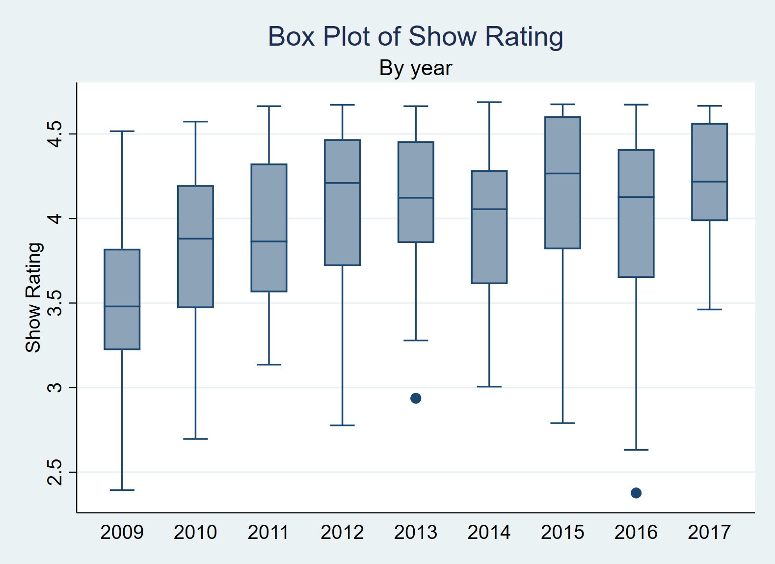
If Phish are improving performance quality, in recent years we should see a higher median, a shorter IQR, and shorter whiskers relative to the past. The plot shows that 2009—while joyful for longtime fans—was fairly rough performance-wise, with a low median and wide variation in show quality. Since 2012 Phish have had a high average show rating, but we saw a lot of variation across shows in 2012, 2015, and 2016. In contrast, Phish performances in 2017 achieved a high median, a tight IQR, and short whiskers.
By these measures, 2017 was indeed Phish’s greatest year since their return--at least according to those of us who rate shows on Phish.net. Not only did the band nearly match its highest yearly average last year (barely behind 2015), but almost every show the band performed was rated close to this average. Overall, Phish seems to have navigated the teeth of time quite well.
Comments
You must be logged in to post a comment.
 The Mockingbird Foundation
There are probably a variety of potential (and unpopular) ways to try to reduce attendance bias and afterglow in the ratings. I wonder what effect a "cooling off" period would have - not allowing a show to be rated until a few days or a week has passed after the show.
As far as biases over time periods of a few years or longer, such as those of newer phans coming to .net, I think those could only be controlled for as part of a statistical analysis. I want to delve into this as soon as I get some free time.
My data are pulled from only publicly available info, and I'm not sure the mods would even allow us to pull individual user data. If we could, then we can control for a variety of selection effects--attendance, recency, and newbie. Frankly, it never occurred to me to ask for this access. Plus, I have no API skills!